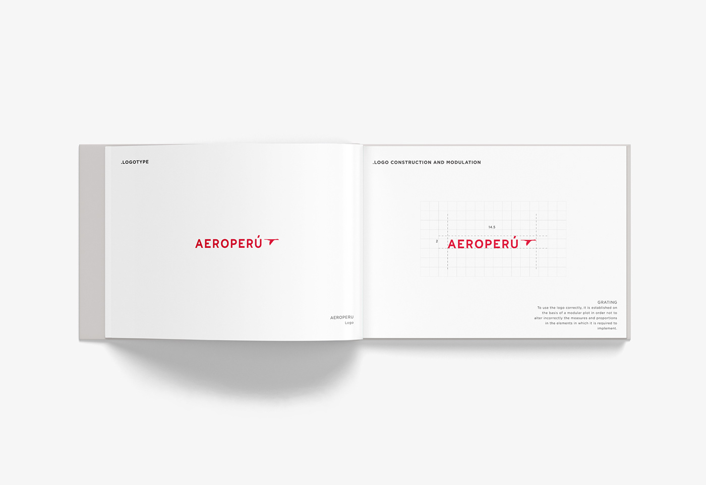
AeroPerú was a Peruvian airline that began operating in 1973 until the late 1990s. This is my approach for the redesign of the brand identity.
Always keeping the name "AeroPerú" but with a new serif typeface with a wide spacing that gives it a touch sober and sophisticated, accompanied by an isotype made up of a bird, which
was inspired by the legend "the dream of the liberator"of Peru, which gave the colors to the
nation's flag and national symbols.
From this reinterpretation the idea of this logo is born.